
If you want to show large banners to desktop users, you need to add a few additional banners for mobile users. This is due to the fact that large banners are not displayed on small devices.
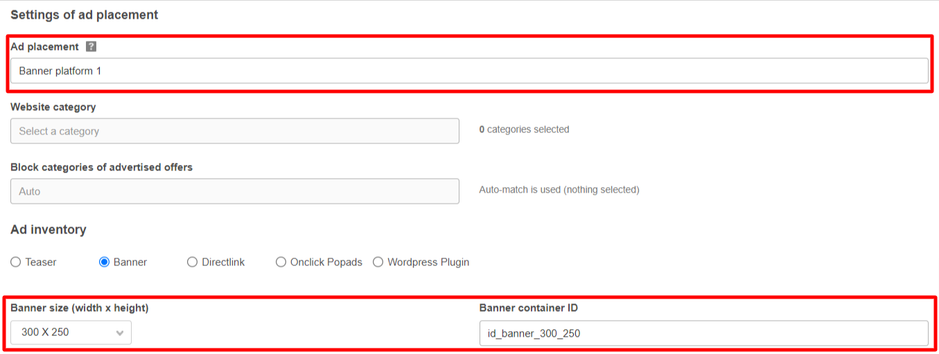
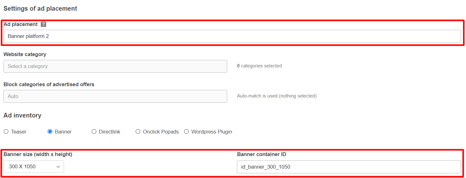
First, let’s create two new platforms using the algorithm you can find here. The only difference between the settings is the “Place Banner Size” option. We will create two ad spaces with the following sizes: 300*250px and 300*1050px.
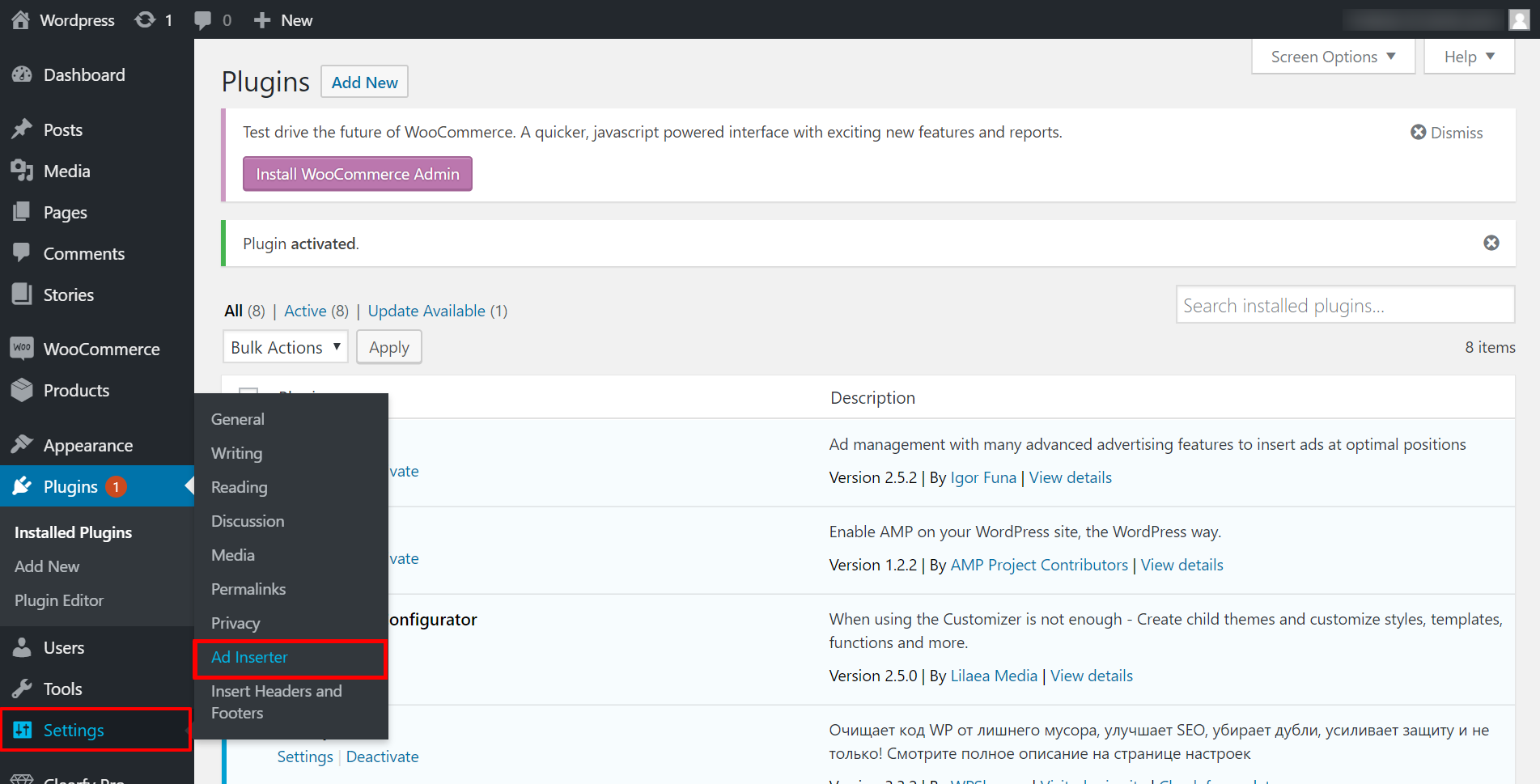
When the platforms are created, open the “Ad Inserter – Ad Manager & AdSense Ads” plugin settings in WordPress by going to the “Settings” – “Ad Inserter” tab.
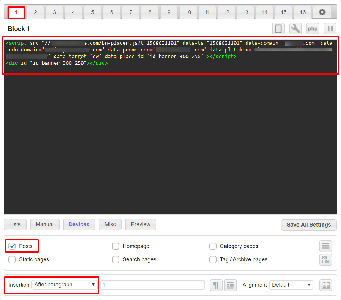
In “Block 1“, insert a link to the script and a <div> tag that contains the banner ID.
<div id="id_banner_300_250"></div>We will display banner ads in posts after the first paragraph. To do this, check the “Posts” checkbox, and in the “Insertion” drop-down list, select the “After paragraph” option. The remaining settings can be left as default.
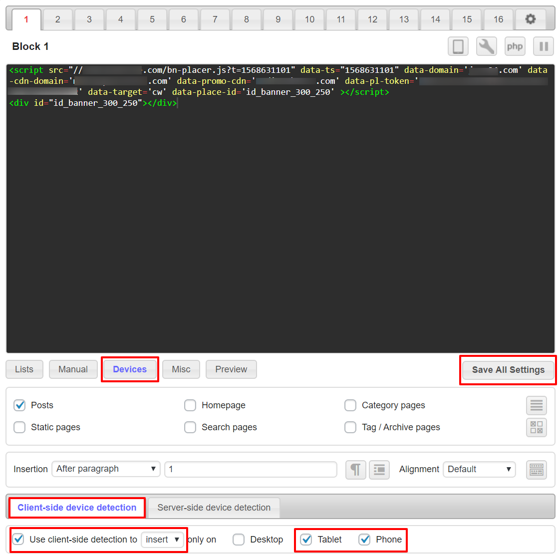
Then press the “Devices” button. On the “Client-side device detection” panel, check the “Use client-side detection” checkbox. From the drop-down list, which is located nearby, select “Insert” and check the items “Tablet” and “Phone“. Click “Save All Settings”.
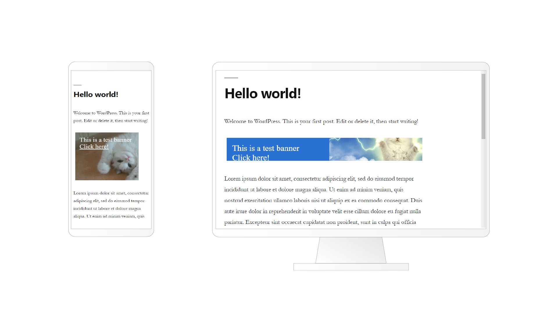
A banner with a size of 300 * 250 pixels will only be displayed on small screen mobile devices.
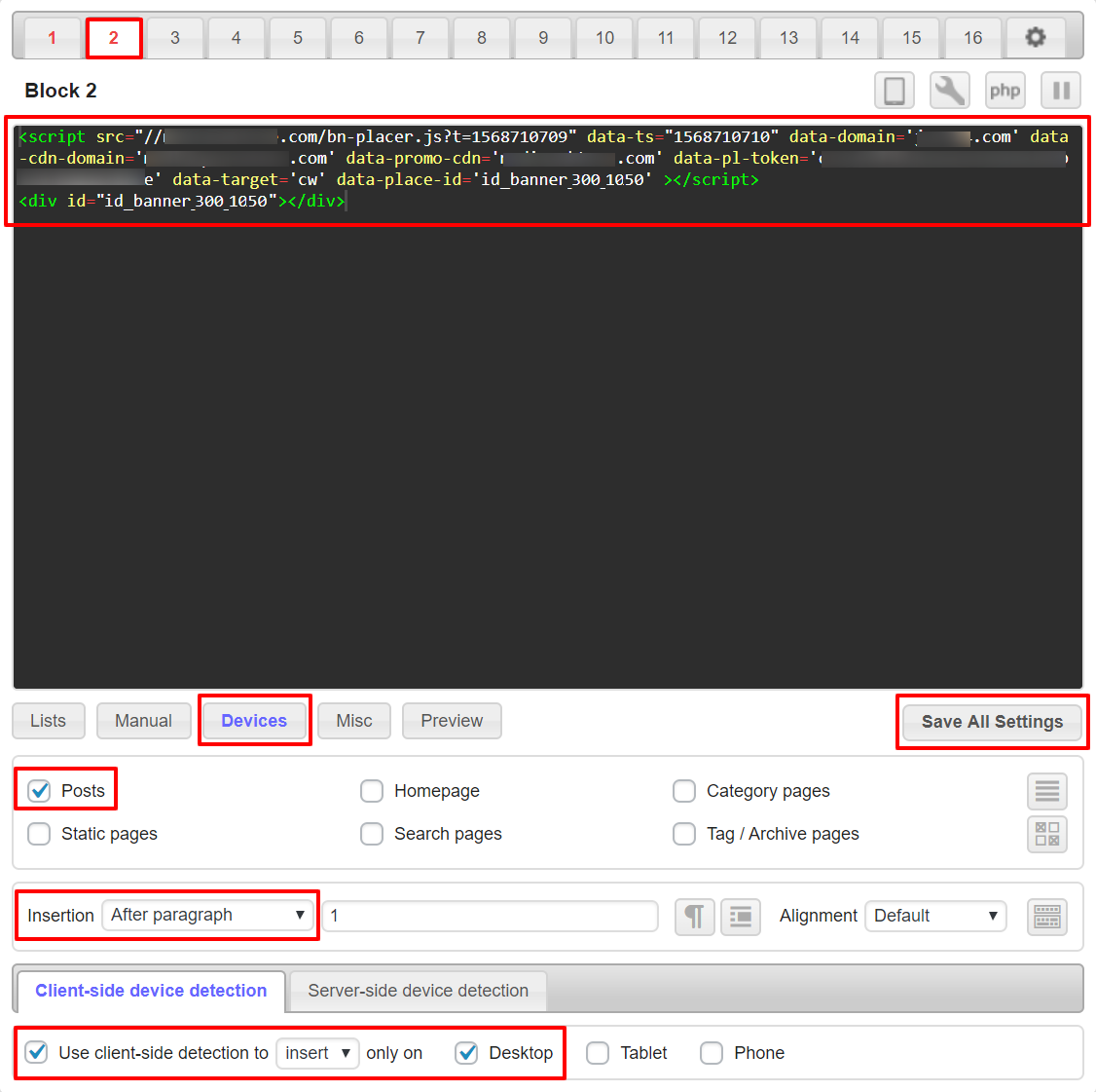
Now let’s consider installing a 300*1050 pixel banner. Let’s go to “Block 2” and paste a link to the script with a <div> tag that contains the banner ID.
<div id="id_banner_300_1050"></div>Select “Posts” and in the “Insertion” drop-down list, select the “After paragraph” option. On the bottom panel, click on “Devices“. In the “Client-side device detection” field that appears, check the box next to “Use client-side detection”, and select “Insert” from the drop-down list. Also note the item “Desktop“. Click “Save All Settings“.
Now when you open a post from devices with different screen sizes, you can see different banners.